An Art Style That’s Visually Striking, But…
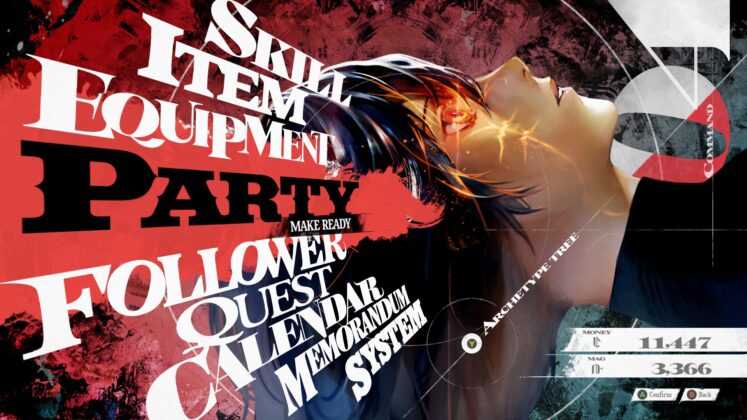
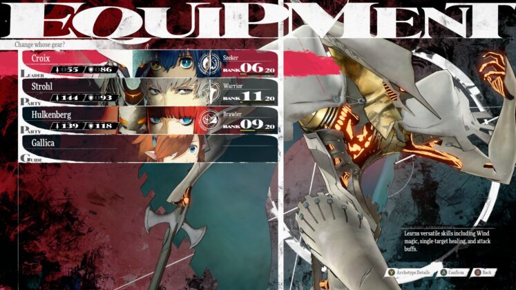
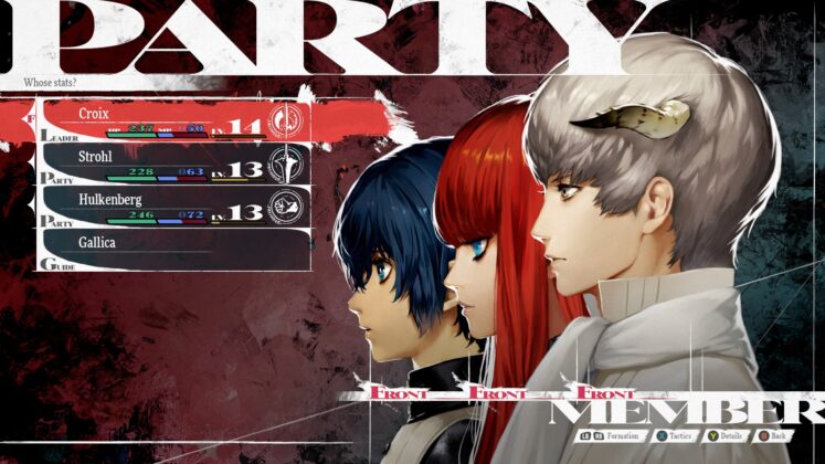
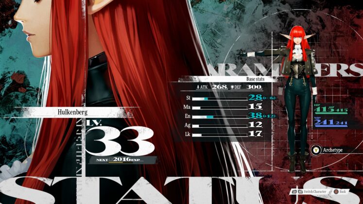
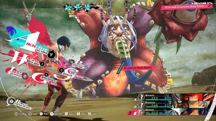
Ever since the release of Persona 5, Atlus (or rather, P-Studio and Studio Zero) has started the trend of elevating the user experience players have while playing their games through stylish but functionally sound user interfaces. In this regard, Metaphor is not an exception; every part of the user interface in the game looks like a piece of painting, setting itself apart from their approach to the user interface design in Persona 5 and Persona 3 Reload. It’s gorgeous to look at, and while some screenshots might make it look busy, it’s surprisingly quite easy to read, which is the most important thing for a user interface.
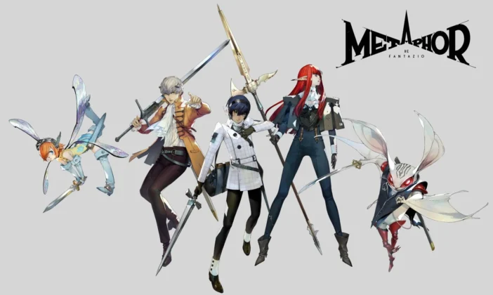
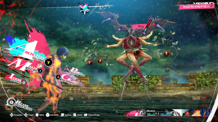
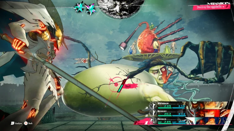
This painterly motif of this game extends further to the character portraits drawn by Shigenori Soejima for this game, defining the identity of Metaphor even further compared to its predecessors. It also has been a while since I’ve seen an Atlus game with completely new monster designs, since Shin Megami Tensei and Persona would usually use their already existing roster of mythological creatures designs in their game. The monsters, or ‘humans’ as the game’s world call them, all have unique designs taking inspiration from Hieronymus Bosch’s paintings (one of them is taken straight out of it, even). It sometimes can look unnerving to look at these designs, but it fit the ‘fantasy’ the game wants to present nonetheless.
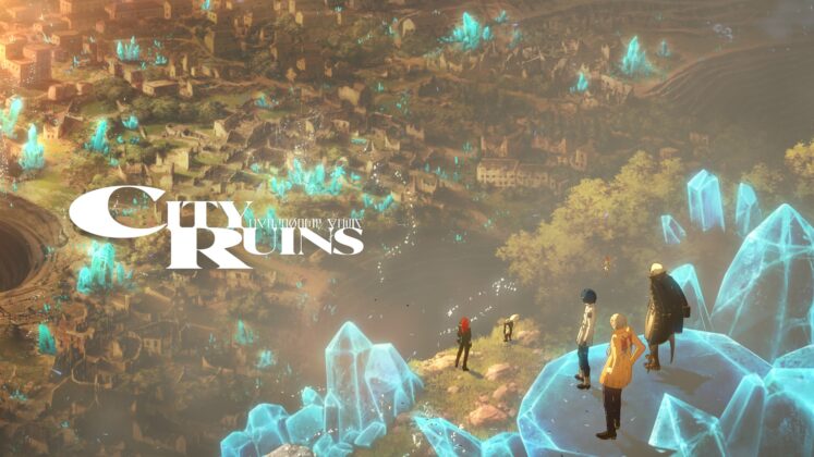
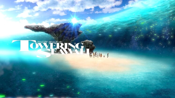
Another thing I liked throughout my playthrough of Metaphor is, that sometimes as you journey through the Kingdom of Euchronia, the party will make stops at landmarks around the kingdom, talking about the significance of that place and the lore behind it. Although it’s not playable, the visuals for these segments are downright gorgeous. The discovery of these landmarks is one of the things I’m most excited about while exploring Metaphor‘s world because of this.
Unfortunately, the art style and direction this game has doesn’t exactly translate well into the in-game visuals itself. Metaphor has been in development for a long time, and you can see it through its somewhat outdated visuals—in my PC copy of the game, there’s a clear lack of anti-aliasing on the game even on the highest settings while on 100% rendering resolution, making the character models look jagged most of the time. The environment textures don’t look impressive either and can look muddy in some places. I’m not really particular about a game’s graphics, especially on an anime-styled game like this, but it’s clearly a weakness compared to the game’s overall presentation. Not to mention, P-Studio’s Persona 3 Reload released earlier this year looks significantly better than this game too.

A Bright Future For Atlus.
While having only played 35 hours of it before writing this review, I am confident in saying that Metaphor: ReFantazio will be an amazing experience all the way through. While it has its downfalls with its graphical and performance issues, it doesn’t entirely worsen the experience this game is ultimately trying to deliver. Through its gameplay mechanics, it’s a game that celebrates Atlus’ history as it combines the best aspects of the games that came before it and packaged it into an intricate fantasy setting. As a long-time fan of Atlus games, I can not be happier to see that, and I hope newer fans who play Metaphor will try and experience the games that became the foundation for it.
Metaphor: ReFantazio has shown me what Atlus and Studio Zero are capable of in developing a brand-new IP, with its intricate world-building, compelling characters, and really fun gameplay mechanics. I’m sure it will be a hallmark release for Atlus, and currently, it’s one of the best turn-based RPGs that have come out in recent years. The future is bright and exciting for Atlus, as this game makes me wonder what the next big thing they will put out in the future, be it coming from this IP or even their other IPs like Shin Megami Tensei and Persona.

The Indonesian Anime Times | Review by Alif Naufal Hakim | The review is based on the PC version of the game, which is provided by SEGA

